Hi, all! So as promised, I’m ready to show you the new Metanoia cover (or at least what I believe will be the new cover – the nice thing about self-publishing is that I can change it if needed). But first, let’s look at the journey…

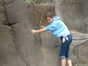
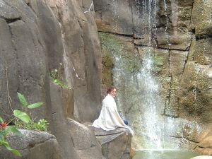
This was the original cover. Since I didn’t know anybody who fit the bill for the looks of the character, I used the only person at my disposal – myself. Yes, that’s me in Golden Gate Park. I was wearing a big and poofy sweatshirt at the time, so I grabbed a blanket from the car, stuffed it under my sweatshirt pregnant-style, and climbed up the rocks to the waterfall. It actually looked quite awkward…
Though I was happy with the cover image, it didn’t give an accurate promise of the words within the book itself. I actually use this cover as an example of what NOT to do for that very reason. I have people guess what the book is about. “Poetry” and “geishas” are the main guesses. Then, I drop the bombshell. It has a lot of sword-fighting. Didn’t see that coming based off that cover did you? So, I’ve been promising a redesign…and putting it off.
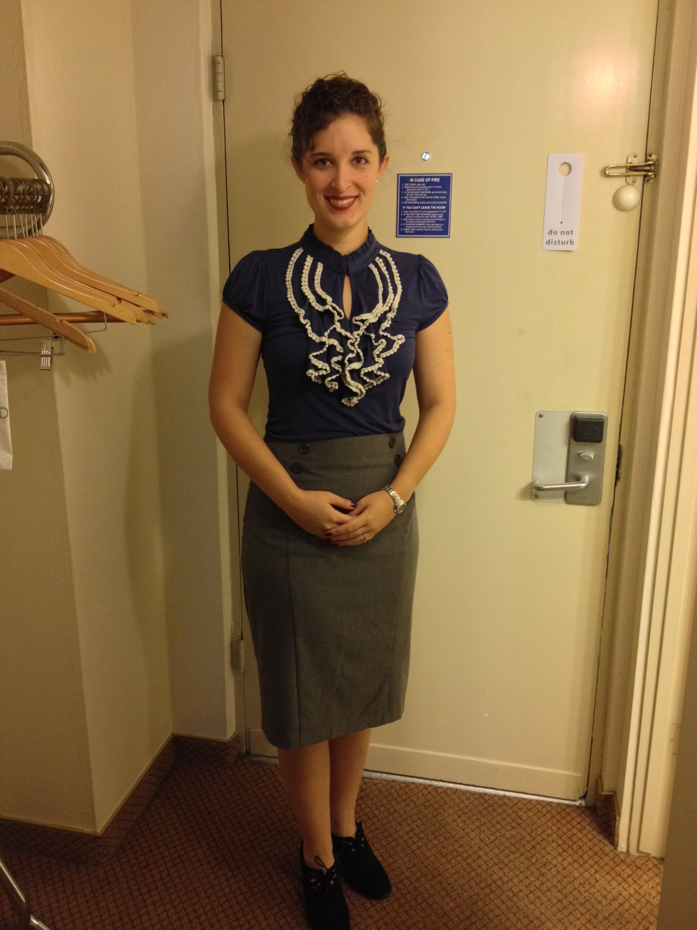
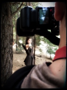
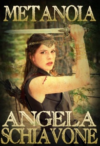
Finally, I had the opportunity to do the shoot. I used my beautiful cousin-to-be, Laura Hannibal, as my model, and my talented and handsome husband-to-be, James Hannibal, as the photographer. Looking through her photographs, I gotta admit that I’m jealous. She didn’t take a single bad shot in the bunch! I’m no stranger to modeling for photographs (I’m marrying a photographer after all!), and yes, I eventually always get the “money shot,” but you can bet that there will be a bunch of me not focused and thus not “smiling with my eyes” and other modeling requirements. But Laura? Nope, she’s a pro all the way.

Photo by James Hannibal

Photo by James Hannibal
I had to wait until my vacation was over before getting to work, but once home, I started some designs…
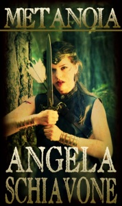
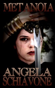
But I didn’t love any of them. They just didn’t have that “it” factor. Everyone judges a book by its cover. If it’s not excellent, people don’t pull it off the shelves. You want a cover that people can’t ignore. You want a cover that people walk past and say, “hey, what’s that about?” It’s the best tool you’ve got as an author, and though the last one in that list was okay, it wasn’t there yet. I admit that I got a bit disheartened. Here I had great photographs, but they were being limited due to my poor editing/design skills. I eventually realized that the font was problematic. So, I went back to fontspace.com, set the filter to show me only commercially-ok-to-use fonts, and started my search over. Then, I changed the photo. After several zoom levels, edits, filters, color changes, and hours, I believe we may FINALLY have a winner:
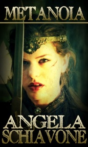
(drum roll please)
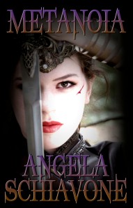
Photo by James Hannibal, Cover Design by Angela Schiavone
What do you think?