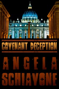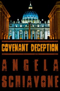
I’ve been working on a speech/presentation for work that is on one of my favorite topics: covers! It’s been really fun. I’ve been looking through all kinds of covers to see which ones I like and which ones fall short. In doing so, I started examining the specific elements on the good covers. I can clearly see that I like this over the others, but why? For my own cover below, I already had a beautiful photo taken by my fiancé, James Hannibal (ShootAnyAngle.com), but what other elements worked or could be improved upon? Well, I found a few elements, and one gave me an idea. Well done covers have easy-to-read fonts, and a lot of them include a gradient on the font fill color. So I thought, let’s try that out! I took my cover for Covenant Deception, and added the gradient font. What do you think?